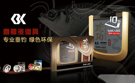
喜曼多SIMAGO品牌怎么样 申请店铺
外推网助力喜曼多SIMAGO品牌出海!将品牌入驻外推网,定制喜曼多SIMAGO品牌推广信息,可以显著提高喜曼多SIMAGO产品曝光,简直是跨境电商爆单神器!目前仅需1000元/年哦~

喜曼多图形LOGO部分以SIMAGO字母组合成一条OK鱼为基本原型,在钓具行业特定的行业属性下体现喜曼多专业垂钓OK、绿色环保OK、团队管理OK的企业精神。以简约理性的线条表现,整体造型质相干练、线条流畅、富有动感。
图像LOGO也是由两扇回形门组成,形成有力向外空间无限的视觉效果,象征通达和高远的涵义,具有强烈的时代感和视觉冲击力。完整的回形门代表SIMAGO主品牌,不完整的回形门部分传递出SIMAGO品牌不断延续和拓展的品牌理念与树百年企业立百年品牌的经营理念相得益彰。
标识以代表高科技、创新、进步的橘红为亮点(C:0 M:85Y:85 K:0)以冷峻、干练的银灰为辅色,表达SIMAGO时尚、专业、环保、科技的企业形象。
Simago letters are combined into an OK fish as the basic prototype in the graphic logo part of Ximan, which reflects the enterprise spirit of Ximan multi professional fishing OK, green environmental protection OK and team management OK under the specific industry attributes of fishing tackle industry. With simple and rational line performance, the overall shape is concise, smooth and dynamic. The image logo is also composed of two back shaped doors, forming a powerful visual effect of infinite space, symbolizing the meaning of accessibility and high, with a strong sense of the times and visual impact. The complete huixingmen represents the main brand of simago, and the incomplete huixingmen part conveys the brand concept of simago brand's continuous extension and expansion, which complements the business concept of building a century old brand of a century old enterprise. The logo takes orange red representing high technology, innovation and progress as the highlight (C: 0m: 85y: 85K: 0) and cool and capable Silver Ash as the auxiliary color to express simago's corporate image of fashion, profession, environmental protection and technology.
本文链接: https://brand.waitui.com/38e026723.html 联系电话:请联系客服添加 联系邮箱:请联系客服添加


 浙公网安备 33011802001999号
